Thursday, 23 August 2012

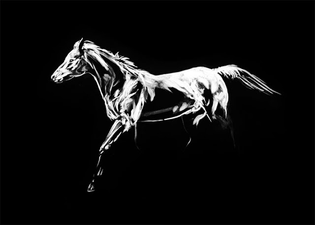
The last of the Running Horses

 Finally the last of the monoprints for The Running Horses are complete!  I definitely want to explore monoprinting further on another project and do some more resolved work rather than this sketchy style and with colour. I don't have much else to say about them really other than I hope they are enjoyed and on to the publication process.

Both of these prints were on A2 Archers and took only 2 hours each including prep and printing.


The first stage of sketching using rag to mock up the anatomy of the horse.
Now begins the refinement of the image. With this series I've found it best to folow the musculature fo the horse in order to describe its form.

Monday, 30 July 2012

Another Atlas


Another experiment with Atlas.

This one was difficult to complete because I changed the viscosity of the etching ink to one that was very unfamiliar. The plate was covered in typical etching ink first, the sketched into with a rag. I wanted to try adding coloured ink, so I thinned it with oil to help the red mix with the black. In consequence, portions of the black ink became thin as well and slippery on the poly plate.

Monday, 23 July 2012

The Lamps: Castle Gates

The Lamps: Castle Gates. 2012. watercolour, graphite and chinagraph on 150 gsm watercolour paper. A3

Sometimes you can become bored with black and white pictures, so I drew the above as an experimental piece. It is simply graphite on watercolour paper that was tinted with a combination of red, orange and yellow and finished with Staedtler chinagraph pencils to recover whites for highlighting. There is a storyboard behind the drawing as it is the conceptual grounding for the project.

Another 29 to go...

Tuesday, 17 July 2012

The Centaur


This monoprint was done as an experiment for my painting class during Sem1 at university. The ink was thinned with oil so that the coloured portions would mix with the thicker black base, which succeeded, but only to present the new difficulty of saving any grey tones. I suspect that this work will be concept to revisit when the time presents itself.

The reference for the human pose can be found at: http://www.posespace.com/. I would greatly recommend this site to those wanting to study human anatomy.

Thursday, 12 July 2012

The Making of Atlas

What have I been doing during my univeristy holidays? Not much of anything solid really. I have, however, sketched storyboards for six separate wordless picture books, re-written half a novel and have started doing the final images for another two picture books. I was complaining in my college dining hall about not completing anything polished when one friend said "Why don't you just DO something?"

The result is the above.

As I have said, nothing is complete but it is comforting to know that I now have these projects that I can come back to or sell in the future and throughout the rest of my degree. Luckily this apiffany occured about two weeks before my second year print folio was due, so I have managed to incoporate one of those storyboards into that oevure. The Three Headed Horse was included in this late addition as my test image for 4 point colour separation screen printing. A few days ago though, when doing a new storyboard, I decided to rename it Atlas.

Atlas began as a brief for a magazine cover. I was able to do just about what ever I liked and took inspiration from "Les deux faces de l'âme" by Wotjek Siudmak. The image can be found at the artist's website: http://www.siudmak.com/. He is one of my favourite illustrators.  


I completed a rough sketch of the composition in charcoal. The plan was to appropriate Siudmak's general composition as a starting point before adding the 3 horse heads to the outside. Horses were used in the composition as I own a pair, making referencing a lot simpler.


One of the few conditions I was given was that the image had to be colourful. I don't use colour very often, so the next step was to do a colour sketch to figure out what colour would be used where.


Using Photoshop I have collaged my reference photographs together to get a better idea of the pose of Atlas.


Atlas was to be drawn small, so this drawing is only about A4 in size. It was drawn in 2B and block shaded, so that when the base coat is applied I can still see the lines. I find this is the best time to apply a thin layer of workable fixative to the work, so the pencil does not lift and mix with the upper coats of paint.


I used acrylic paint for the base colours.


 Polychromos colour pencils were used to build up the work. These pencils are very oily and blend easily, so a layer of white was done first, then a combination of yellow and orange. At this point blue is included to the shadows with a layer of black.


One of my new story boards includes Atlas a key feature in the story, so it will probably be revisited in the future.

The magazine cover that Atlas was originally made for can be found at the OZ Kids in Print website: http://www.ozkids.com.au/cssMagazine.php?id=2012_05

Wednesday, 13 June 2012

David Bromley's Kaleidoscope


If you are in Claremont during the next month you should pop by the Quarter to see Bromley's new show. It's on the 2nd level and showcases a large variety of works from his female portraits to 50's inspired paintings of children. Some are as small as a laptop and others large enough to fill a wall, with a collection of what looked to be bronze sculptures at the heart of the exhibition. Most of the works have already sold but it is a great opportunity to see his works up close, particularly if you are like me and are interested in seeing how the paintings are done.